Wednesday, September 22, 2010
First Assignments
Almost forgot about these. These two assignments were our first introduction to creating 3-dimensional forms. The first one had us creating a three-dimensional surface on a two-dimensional plane using an x-acto knife and some creative folding. The second one was to create a three-dimensional sculpture exhibiting gradation and movement. These aren't that great, but I'm putting them up just for you!


Chair Model
Our final assignment is to design and create a chair using nothing more than cardboard and glue. For this week, we were supposed to create a model of our chair using Bristol board. This is my chair. Cute, huh?
more views...
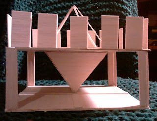
3-D Composition from Balsa Wood
For this assignment, we were supposed to create a three-dimensional composition out of balsa wood. The design was supposed to demonstrate the concepts of line, plane, and volume, while displaying symmetry, balance, harmony, and proportion. I designed it so that the solid form at the bottom would be balanced by the open space surrounding it, while the open form at the top gets some visual weight from the walls of rectangles. However, the two shapes form an octahedron, so the continuation of line is what brings harmony to the piece.
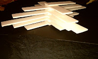
Interlocking Identical Forms
This assignment called for us to design and create our own three-dimensional forms that would be able to interlock. There are examples of this in real life, such as lego blocks and logs for log cabins. I was inspired by Tetris for this one.
Here are some other configurations
Stellated Platonic Solid with a Void
This time our assignment was to add stellations to a Platonic solid. Stellations are additions to a solid that form a point with the number of sides on the stellation equal to the number of sides on the shape to which it's attached. So, since an octahedron is composed of equilateral triangles, its stellations will have 3 sides. I chose to work with the octahedron again and this is how it turned out -- pretty, eh?
In addition to stellations, we were supposed to create a void in one side. This is simply a "hole" dug out of the solid, as you can see here. I created it by folding a stellation inward instead of out, like the others. Bristol board.
Archimedean Solids
Archimedean solids are formed from 2 or more regular polygons. There are only 13 solid shapes that can be formed this way. This one is called a snub cube -- it's composed of 12 squares and 32 equilateral triangles. Bristol board.
Platonic Solids
No, that's not a solid who's just a friend. :) Named after Plato, who studied geometric solids. He identified 5 shapes that could be formed from multiplying regular polygons (that is, a shape with equal angles and equal-length sides).
Here's a li'l octahedron (that's a solid composed of eight equilateral triangles) I made from Bristol board and love.
Here's a li'l octahedron (that's a solid composed of eight equilateral triangles) I made from Bristol board and love.
And now some 3-D stuff
An assortment of projects from my Theory and Development of Form class this quarter...
It's the FINAL COUNTDOOOOWN!!!
Haha, now you have that song in your head, don't you? This is my final drawing for this class. It's supposed to incorporate everything we've learned this quarter about shadow, light, tonal and line variation, and drawing objects in perspective. In addition, it had to include one horizontal cylinder, one vertical cylinder, at least 2 ellipses, one abstract letter or symbol drawn using a rectangular prism as a guide (that's the pi in the sky you see), and a clear light source. I chose to render a surrealistic scene in 2-point perspective.
graphite and charcoal on paper.
graphite and charcoal on paper.
Three-Point Perspective Drawing
*Sigh* This is my favorite drawing I've done so far and unfortunately the flash washed out the rich, rich color I spent hours lovingly applying. Trust me when I say it's bad-ass. ;)
colored pencil and marker on paper.
colored pencil and marker on paper.
Cone, Cube, and Cast Shadows
This assignment called for us to draw a cone and a rectangular prism in a scene with a defined light source. Thanks to Matt for coming up with the idea for this drawing!
graphite, charcoal, and colored pencil on paper.
graphite, charcoal, and colored pencil on paper.
One-Point Perspective from a Photograph
This assignment was the same as the last one, except we had to find an example of one-point perspective to interpret. I'd gotten much more comfortable with the Art Stix by the time I finished this -- the color was so rich many people thought I'd used pastels.
colored pencil, graphite, charcoal, and marker on paper.
colored pencil, graphite, charcoal, and marker on paper.
Two-Point Perspective from a Photograph
For this drawing, we were to find a photograph depicting two-point perspective and interpret it. This one was very popular with the class.
graphite and charcoal on paper.
graphite and charcoal on paper.
Two-Point Perspective Boxes
Two-point boxes this time. Again, practicing drawing above, below, and straddling the horizon. I had just purchased some fancy Prismacolor art stix and was attempting to get the hang of them.
colored pencil on paper.
colored pencil on paper.
One-Point Perspective Buildings
This is a sketchy drawing of a few buildings in one-point perspective, one below the horizon, one straddling it, and one above it.
graphite and colored pencil on paper.
graphite and colored pencil on paper.
One-Point Perspective Boxes
My first foray into perspective drawing, we were to draw a series of boxes at different heights above, below, and straddling the horizon.
graphite and colored pencil on paper.
graphite and colored pencil on paper.
Perspectives
The next 8 pictures will be of my assignments for Perspective Drawing class this quarter. I had fun in this class, and it pushed me to excel in my drawing even more than before. I hope you enjoy my work...
Wednesday, June 16, 2010
Dada da da da da
This is another studio assignment for my Art History class, this time in the Dada style (post-WWI, pre-WWII). They loved collage as a medium, and I'd never really experimented with it, so I thought I'd give it a try. It's probably a commentary on materialism and consumerism and the fact that we keep cranking out more babies to take up those flags, but I really just chose the images that said, "hey, cut me out!"
Monday, June 14, 2010
The Joy of Cookie
This was my final project for Color Fundamentals class. The assignment was to create one design and use twelve different chromatic strategies. The medium I chose (don't ask me why) was iced sugar cookie. The picture didn't turn out as well as I'd hoped, and the cookies are gone (so no re-shoot opportunity), but I think you can get a sense of the project from the photo nonetheless. Not only were we to use different chromatic strategies, but since there were twelve, we were also supposed to associate each with a month of the year. The cookies in the picture are laid out in calendar order, reading from left to right, top to bottom. The twelve chromatic strategies are as follows:
1. January -- achromatic: browns, grey, black
2. February -- monochromatic: hue, tint, tones, and shade of blue
3. March -- value contrast: significant "lightness/darkness" contrast using the violet hue
4. April -- split complementary: violet, yellow-green, and yellow-orange
5. May -- tetradic chord: red-violet, blue, orange, and yellow-green
6. June -- warm/cool: mix of warm and cool hues with a neutral color (brown)
7. July -- saturation key: all highly saturated (relative brightness or dullness of a color) hues
8. August -- value key: all hues at relatively the same value (relative lightness or darkness of a color)
9. September -- achromatic/chromatic mix: a blend of neutral browns with blue and green hues
10. October -- analogous: red-orange, orange, yellow-orange
11. Novemeber -- triadic chord: red-violet, blue-green, yellow-orange
12. December -- complementary: red and green
It was an involved process: I baked the cookies, mixed all the colors (20+) from scratch, and painted each cookie by hand; I nearly bit off more than I could chew (no pun intended), and if I see another sugar cookie before Christmas, it'll be too soon. But, I'm glad I challenged myself to do something extremely creative and that I'd never tried before. My classmates were happy I'd chosen to create edible art, as well. :)
1. January -- achromatic: browns, grey, black
2. February -- monochromatic: hue, tint, tones, and shade of blue
3. March -- value contrast: significant "lightness/darkness" contrast using the violet hue
4. April -- split complementary: violet, yellow-green, and yellow-orange
5. May -- tetradic chord: red-violet, blue, orange, and yellow-green
6. June -- warm/cool: mix of warm and cool hues with a neutral color (brown)
7. July -- saturation key: all highly saturated (relative brightness or dullness of a color) hues
8. August -- value key: all hues at relatively the same value (relative lightness or darkness of a color)
9. September -- achromatic/chromatic mix: a blend of neutral browns with blue and green hues
10. October -- analogous: red-orange, orange, yellow-orange
11. Novemeber -- triadic chord: red-violet, blue-green, yellow-orange
12. December -- complementary: red and green
(cookie design template)
It was an involved process: I baked the cookies, mixed all the colors (20+) from scratch, and painted each cookie by hand; I nearly bit off more than I could chew (no pun intended), and if I see another sugar cookie before Christmas, it'll be too soon. But, I'm glad I challenged myself to do something extremely creative and that I'd never tried before. My classmates were happy I'd chosen to create edible art, as well. :)
Wednesday, June 9, 2010
Man with the Hat
Another studio assignment for Art History, this time in the style of the Fauve Expressionists. (This is an homage to Matisse's Woman with the Hat.)
Graphite and colored pencil on paper.
Graphite and colored pencil on paper.
More fun with card stock
Experiment with the Bezold Effect
Working with simulated transparency:
"Dipping Toes." Cardstock mounted on illustration board.
"Dipping Toes." Cardstock mounted on illustration board.
van Gogh'd Sunset
Studio Assignment for my Art History class, done in the style of the Post-Impressionists. Acryla Gouache on paper.
Tuesday, June 8, 2010
Impressionism Impression
Studio assignment for Art History in the style of the Impressionists. Didn't have oils or pastels (plus, I don't know how to use them), so I used charcoal. :)
Friday, May 14, 2010
Texture and perspective
(Drawings exploring rendering texture and capturing 2-point perspective)
2 textures
graphite on paper

Bookshelf
graphite on paper
Bed in a Room
charcoal on paper
Ch-ch-ch-chia...roscuro!
(First experiments with defining forms via tonal variations vs. contour lines)
Sphere
graphite on paper
graphite on paper

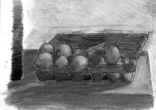
Still life with eggs
charcoal on paper
Hand-y Contour Studies
(First assignments for my observational drawing class.) Graphite on paper.
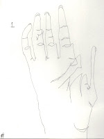
blind contour drawing
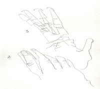
blind contour drawing

modified blind contour drawing
Subscribe to:
Comments (Atom)


